How to Use TomTom Data for Predictive Modeling
Use Python and data science tools (Jupyter, NumPy, Pandas, scikit-learn) to make traffic predictions

We love maps. We love data. We love developers.
TomTom Maps and API services produce massive volumes of data. Data scientists can access this data to gain insight and make predictions supporting business decisions for better performance and customer satisfaction.
We data scientists and developers can find various historical and real-time data to help with our projects, such as traffic stats, real-time traffic,location history,notifications, maps and routing, and road analytics. TomTom’s extensive documentation and developer community support us as we play with this rich, easily accessible data. For example, we can use TomTom’s data for predictive modeling.
In this article, we’ll do a hands-on exploration of how to use TomTom API data for predictive modeling. We’ll use accident data to learn when and where accidents are most likely to take place. You’ll see just how easy it is to use TomTom’s mapping data for your data science projects. We’ll pull traffic data from a map application, which connects to TomTom APIs, then extract a dataset to build a model for predictions. For our supervised learning task, we’ll be using RandomForestRegressor.
After training the model, we’ll evaluate and refine it until it is accurate, then deploy it to work with the TomTom Maps API in real-time. Finally, we’ll use Python and some favorite data science tools (Jupyter Notebook, NumPy, Pandas, and scikit-learn) to explore our data and make predictions.

CREATING A PREDICTIVE MODEL BASED ON TOMTOM DATA
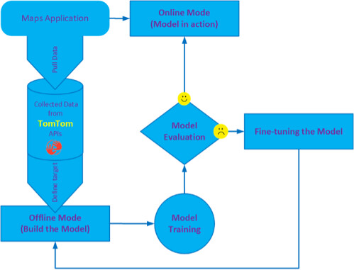
To create our model, we first pull data from TomTom APIs connected to a map application. Then, we follow the framework in the image below to prepare the dataset, build, train, and evaluate the model. If necessary, we refine our model. Finally, we deploy our model to deliver traffic insights.
Our framework has two modes:
Offline mode: We export the model’s dataset as a CSV or Excel file. We then build the model, train it, refine it until it gives acceptable outcomes, and finally deploy it to the online mode to produce practical recommendations and valuable insights. Online mode: Our trained model uses map application input data to instantly predict and produce insights and recommendations for real-time situations.
We use the Python programming language inside Jupyter Notebook (IPython) depending on the Numpy, Pandas, and scikit-learn packages. To solve our accident prediction problem, we select RandomForestRegressor from the scikit-learn library and the ARIMA model for time series analysis.
To be able to work with TomTom Data, we must have a valid TomTom developer account, and retrieve a TomTom Maps API key from our account. We use this key inside our maps application to connect to some services such as Zapier to pull data from our applications’ webhooks generated from TomTom Data services. Also, to be able to use Zapier with TomTom webhooks, we must create a Zapier account and set up a connection to our map’s application. After that, we can collect our data from TomTom APIs using Zapier, and store it either on the application database (for online mode) or in a CSV file (for offline mode).
GETTING STARTED
To begin working with our project data, we need to build a model for predicting accidents monthly, weekly, daily, hourly, and even based on street codes. As mentioned in the previous section, the model also performs time-series analysis on the data derived from TomTom APIs.
We begin by importing the Python libraries and other functions to set up our environment:
# Import helpful libraries
import numpy as np
import pandas as pd
import matplotlib.pyplot as plt
import seaborn as sns
%matplotlib inline
from IPython.display import display
import warnings
warnings.filterwarnings("ignore")
EXPLORING THE DATASET
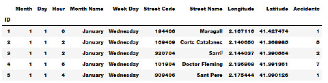
To start exploring our dataset, we load it into a Pandas DataFrame. Before building our predictive model, we must first analyze the dataset we are using and assess it for common issues that may require preprocessing.
To do this, we display a small data sample, describe the type of data, learn its shape or dimensions, and, if needed, discover its basic statistics and other information. We also explore input features and any abnormalities or interesting qualities that we may need to address. We want to understand our dataset more deeply, including its schema, value distribution, missing values, and categorical feature cardinality.
The code below loads our dataset and displays a small sample with some statistical information:
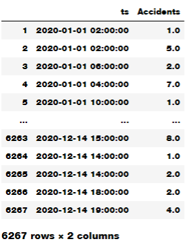
accidents_data = pd.read_csv('traffic_data.csv')
display(accidents_data.head())
Also, we may need to explore the dataset characteristics using the code below:
accidents_data.info()
accidents_data.dtypes
accidents_data.isnull().sum()
accidents_data.describe()
accidents_data.columns
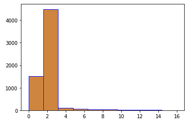
To understand the relationships between our data’s various components — and potentially find abnormalities and peculiarities — we use the Python’s Matplotlib or Seaborn library to plot and visualize the data. The following code displays a histogram for accidents overall density in our dataset:
sns.distplot(accidents_data.Accidents)
plt.hist(accidents_data.Accidents,facecolor='peru',edgecolor='blue',bins=10)
plt.show()

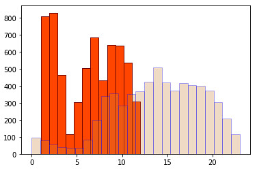
Also, we may need to look at monthly and hourly histograms to estimate the amount of accidents. We can use the following piece of code to do so:
plt.hist(accidents_data['Month'],facecolor='orangered',edgecolor='maroon',bins=12)
plt.hist(accidents_data['Hour'],facecolor='peru',edgecolor='blue',bins=24,alpha=0.3)
plt.show()
Another way to look at accidents we have in our dataset is to use pie charts. The following code demonstrates how to use pie charts for an overview of accidents in a year:
fig, axs = plt.subplots(1,2,figsize=(10, 5))
plt.subplots_adjust(left=0.5,
                    bottom=0.1,
                    right=2,
                    top=0.9,
                    wspace=0.5,
                    hspace=0.5)
axs[0].pie(m_frequency.values(),labels=Months)
axs[0].axis('equal')
axs[0].set_title('Monthly',y=1.1,size = 18)
axs[1].pie(d_frequency.values(),labels=WeekDays)
axs[1].axis('equal')
axs[1].set_title('Daily',y=1.1,size = 18)
 fig.suptitle('Accidents over a year',x=1.1,y=1.1,size = 18)
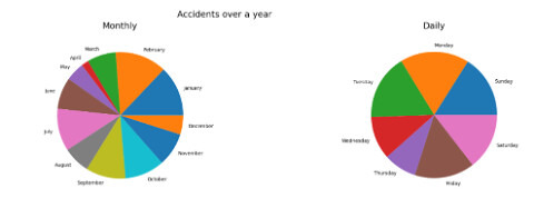
Notice that the holiday seasons have a lower accidents rate. And during the week, the number of accidents is an even distribution except for the holidays. This means that accidents in our data are strongly correlated to workdays and times.
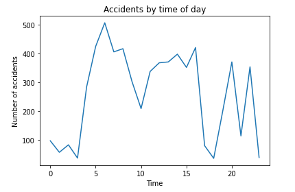
In addition, we could use line graphs to inspect the behavior of some features. The following code shows the number of accidents for each hour of the day:
plt.plot(h_codes,h_frequency.values())
#Adding the aesthetics
plt.title('Accidents by time of day')
plt.xlabel('Time')
plt.ylabel('Number of accidents')
#Show the plot
plt.show()
Or, we can use bar graphs to display monthly accidents over the year as shown below:
plt.bar(m_codes, m_frequency.values())
plt.xlabel('Month', fontsize=5)
plt.ylabel('Number of accidents', fontsize=5)
plt.xticks(m_codes, Months, fontsize=5, rotation=30)
plt.title('Monthly accidents over a year')
plt.show()
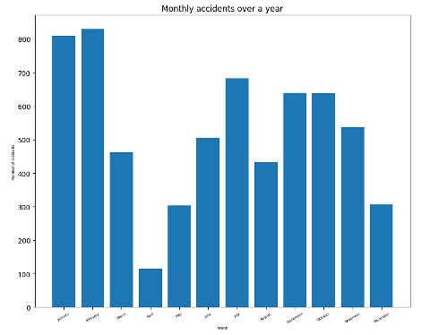
From the previous visualization, we see that most accidents occur mainly at the start of the year. After that, the number of accidents goes down for a while, then rises during the third quarter. Perhaps this is because schools open around that time of year. Then the number begins to decrease again up to the end of the year. In addition, we can see that daily accidents increase during rush hours.
To observe relationships between features in our dataset, we can use a scatter plot. A scatter plot puts one data feature along the x-axis and another along the y-axis and draws a dot for each data point. Here we index streets using their street codes as TomTom provides all the streets inside the city classified by code. We create the index to use the street code.
With the following code, we can explore the number of accidents on different streets:
streets=range(1,701857)
street_codes=[]
s_frequency = {}
for s in accidents_data['Street Code']:
    if s in s_frequency:
        s_frequency[s] += 1
    else:
        s_frequency[s] = 0
        street_codes.append(int(s))
plt.rcParams.update({'figure.figsize':(10,8), 'figure.dpi':100})
plt.scatter(street_codes, s_frequency.values(), c=street_codes, cmap='Spectral')
plt.colorbar()
plt.title('Accidents accross the streets')
plt.xlabel('Street Code')
plt.ylabel('Number of Accidents')
plt.show()
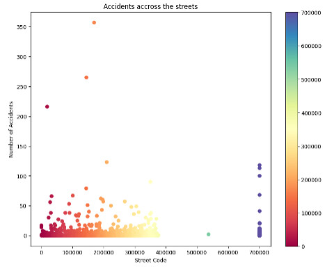
The above graph shows that some streets have a high number of accidents (blue circles). The other streets are at a normal number.
As shown above, we can use TomTom data for real-time information on traffic and weather conditions, which are useful in identifying accident hotspots and other valuable statistics.
Before proceeding to build our model, we must preprocess our data set to have a features data frame and a target data frame (the prediction variable) as follows:
y=accidents_data.Accidents
features = ['Month', 'Day', 'Hour','Street Code','Latitude', 'Longitude']
X=accidents_data[features]
SPLITTING THE TRAINING SET AND TEST SET
Before we build our model, we need to split our data into two parts: a training set and a test set. We use the training set to build our machine learning model. Then, we use our test set to measure how well the model works.
We cannot use the same data for both tasks because our model can simply remember the whole training set and consistently make correct predictions for any point in the training set.
The scikit-learn software contains a function that shuffles the dataset and splits it for us using the train_test_split function. This function extracts 75 percent of the data rows as the training set along with their corresponding labels. It calls the remaining 25 percent of the data and their labels for the test set.
We now call train_test_split and assign the outputs using this code:
from sklearn.model_selection import train_test_split
train_X, val_X, train_y, val_y = train_test_split(X, y, random_state = 0)
BUILDING THE MODEL
Now we can start building the actual learning model. We can choose from many classification algorithms in scikit-learn, but here we use RandomForestRegressor. We use the following code:
from sklearn.ensemble import RandomForestRegressor
from sklearn.metrics import mean_absolute_error
predictive_model = RandomForestRegressor(random_state=1)

Then we will train a predictive model to predict the number of accidents based on the specified features as follows: -

predictive_model.fit(train_X, train_y)
accidents_preditions = predictive_model.predict(val_X)
model_err = mean_absolute_error(val_y ,accidents_preditions)
print("Validation Error for Random Forest Model: {:,.0f}".format(model_err))
The predictions resulting from our model depend on many traffic conditions such as the period of the year, week, day, time of the day, or street area codes. We may expect more accidents in streets far away from the origin (starting point) with heavy traffic and on workdays and rush hours.
Next, we must define the metrics or calculations to measure our model’s performance and results. We must score our predictions using the given examples’ actual classifications. We should justify these calculations and metrics based on our problem’s characteristics and domain.
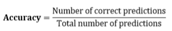
We can use a variety of performance measurement metrics, such as accuracy (A), precision (P), recall (R), and F-score. Here, we evaluate our model’s accuracy (classification rate), which is the fraction of predictions our model predicted correctly.
We compute the accuracy score using the following formula:
We could do further inspection of the accident data by performing an analysis of a series of data points (number of accidents per time stamp) recorded at different time intervals using various statistical tools and techniques. For the sake of simplicity, we use the well-known statistical model called ARIMA for our time-series analysis. This helps in time-series forecasting — in other words, predicting the future values of a time-series based on past results.
To do this analysis, we need to build a time-series sample from our dataset as follows:
import datetime
from pandas import DataFrame
dates=[]
for i  in range(1,len(X)+1):
    dates.append(datetime.datetime(2020, X['Month'][i], X['Day'][i],X['Hour'][i]))
dates_df=DataFrame(dates,columns=['ts'])

Then we clean it from the missing values using the following code:

df=pd.concat([dates_df, acci_df.to_frame()], axis=1)
from statsmodels.tsa.stattools import adfuller
from numpy import log
clean_df=df.dropna()
clean_df=df.dropna()
sample = adfuller(clean_df.Accidents)
print('ADF Statistic: %f' % sample[0])
print('p-value: %f' % sample[1])
To make the time series stationary, we have to differentiate it and see how the autocorrection plot looks. The code below shows how to do this:
from statsmodels.graphics.tsaplots import plot_acf, plot_pacf
plt.rcParams.update({'figure.figsize':(9,7), 'figure.dpi':120})
fig, axes = plt.subplots(3, 2, sharex=True)
axes[0, 0].plot(clean_df.Accidents); axes[0, 0].set_title('Original Time Series for accidents over a year')
plot_acf(clean_df.Accidents, ax=axes[0, 1])
axes[1, 0].plot(clean_df.Accidents.diff()); axes[1, 0].set_title('1st Order Differencing')
plot_acf(clean_df.Accidents.diff().dropna(), ax=axes[1, 1])
# 2nd Differencing
axes[2, 0].plot(clean_df.Accidents.diff().diff()); axes[2, 0].set_title('2nd Order Differencing')
plot_acf(clean_df.Accidents.diff().diff().dropna(), ax=axes[2, 1])
plt.show()

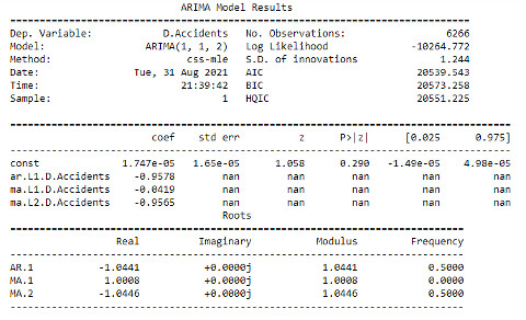
Now, we can build an ARIMA model as follows:
from statsmodels.tsa.arima_model import ARIMA
model = ARIMA(clean_df.Accidents, order=(1,1,2))
model_fit = model.fit(disp=0)
print(model_fit.summary())
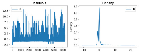
The following code shows how to plot the residual errors:
residuals = pd.DataFrame(model_fit.resid)
fig, ax = plt.subplots(1,2)
residuals.plot(title="Residuals", ax=ax[0])
residuals.plot(kind='kde', title='Density', ax=ax[1])
plt.show()
In the above analysis, we found that the time-series in our model are non-stationary. This means that the accidents occur based on occasional conditions, not regular ones, as discussed earlier when analyzing the predictive model based on TomTom data.
NEXT STEPS
TomTom makes it easy for data scientists to pull data from APIs and put it to work. After quickly and efficiently pulling traffic data from our map application, which connects to TomTom APIs, we extracted a dataset to build our model. We used RandomForestRegressor for our supervised learning task. Then, to explore and visualize our data, we split our data into training and test sets.
After training the model, we evaluated and refined it until it was accurate, then deployed it to work with the TomTom Maps API in real-time. With this model, we can now predict when and where accidents are most likely to occur. With a model like this, a fleet logistics team can predict how many accidents their fleet’s vehicles will likely experience based on the routes they travel.
This is only one example of what you can predict with TomTom data. For example, you could also predict how much time the vehicles will spend delayed in traffic, the influence of several route options on their estimated time of arrival, and more. These predictions can help determine the best routes for fleets to take to their destination, with fewer delays and less chance of an accident.
To put TomTom’s wealth of historical and real-time traffic data to work in your own data science applications, sign up and start using TomTom Maps today. Enjoy thousands of requests for technical support daily, all for free.
This article was originally published at developer.tomtom.com/blog.


