Visualizing TomTom Traffic Data with Data Science Tools
It’s easy for data scientists to visualize and analyze data from TomTom’s APIs — learn how.


Data scientists have more tools than ever before to synthesize datasets into valuable insights. But those insights require data to work from. TomTom makes it easy for developers and data scientists to quickly pull data from its Maps APIs and put them to work using their favorite tools.
No matter what kind of data analysis we need to perform, we typically start by visualizing the data to understand it. Visualization also helps us to identify outliers, clusters, or trends. As data scientists, we like to have our data in the form of a data frame, usually using the Pandas library. Data frames help to organize, clean, sort, summarize, and visualize datasets quickly. Once we have Pandas DataFrames, we can use standard data science visualization tools for rendering our data.
The question is how to convert data that usually return JSON formatted responses from TomTom services, like the TomTom Routing API or TomTom Traffic Flow API, into a Pandas DataFrame. There’s an excellent solution integrated into the Pandas library that we can use: the json_normalize function. It helps us convert JSON objects into a Pandas DataFrame with ease.
This article demonstrates how to retrieve data from the TomTom Routing API, convert it to a data frame, and then visualize the data using standard plotting tools Matplotlib and Seaborn.
RETRIEVING DATA
We start by retrieving route information from the TomTom Routing API. Visit TomTom’s documentation page (API Explorer tab) to dive into how this API works.
After clicking Try It Out, complete all the text boxes and select values from the drop-down lists. For this tutorial, we’ll use JSON formatted responses. So, make sure you set the contentType to JSON.
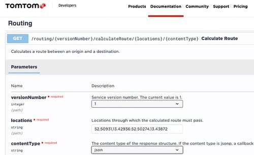
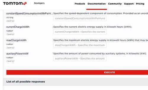
Once you’ve configured all the parameters, click Execute:
The service generates the response containing route information. It looks like this:
{
  "formatVersion": "0.0.12",
  "routes": [
    {
      "summary": {
        "lengthInMeters": 1147,
        "travelTimeInSeconds": 159,
        "trafficDelayInSeconds": 0,
        "trafficLengthInMeters": 0,
        "departureTime": "2021-11-11T08:58:09+01:00",
        "arrivalTime": "2021-11-11T09:00:48+01:00"
      },
      "legs": [
        {
          "summary": {
            "lengthInMeters": 1147,
            "travelTimeInSeconds": 159,
            "trafficDelayInSeconds": 0,
            "trafficLengthInMeters": 0,
            "departureTime": "2021-11-11T08:58:09+01:00",
            "arrivalTime": "2021-11-11T09:00:48+01:00"
          },
          "points": [
            {
              "latitude": 52.5093,
              "longitude": 13.42937
            },

            // The rest of points appear here

            {
              "latitude": 52.50275,
              "longitude": 13.43873
            }
          ]
        }
      ],
      "sections": [
        {
          "startPointIndex": 0,
          "endPointIndex": 28,
          "sectionType": "TRAVEL_MODE",
          "travelMode": "car"
        }
      ]
    }
  ]
}
To send a similar request programmatically with Python, we can use a requests module. It provides a GET method that sends GET HTTP requests to the selected URL. For the TomTom Routing API, the minimal URL includes the route start and endpoints. We use query string parameters to specify the response format and optional parameters (as in API Explorer).
Here is the URL that you can use to get the route information between San Francisco (37.77493,-122.419415) and Los Angeles (34.052234,-118.243685):
https://api.tomtom.com/routing/1/calculateRoute/37.77493%2C-122.419415:34.052234%2C-118.243685/json?traffic=true&departAt=2021-11-10T00%3A00%3A00&key=<YOUR_API_KEY_GOES_HERE>
The above URL specifies that the response should include live traffic data and the departure date and time (departAt). Historic traffic data (speed profiles) is always taken into account when calculating a route. Note that setting a future or past departure time with the departAt parameter means that live traffic will not apply regardless of the value of the traffic parameter.
After sending the request, we get a response like that shown earlier. Here, we use the only data contained in the summary, and we send several requests by parameterizing departAt to build the route data set, which we convert to Pandas DataFrames.
You can find the complete Jupyter notebook here.
First, we import the necessary packages (the list of pip packages you need to install is here:
import pandas as pd
import requests
import urllib.parse as urlparse
import datetime
Then, we set up our request parameters:
start = "37.77493,-122.419415"               # San Francisco
end = "34.052234,-118.243685"                # Los Angeles
key = "<TYPE_YOUR_API_KEY_HERE>"             # API Key

# Base URL
base_url = https://api.tomtom.com/routing/1/calculateRoute/
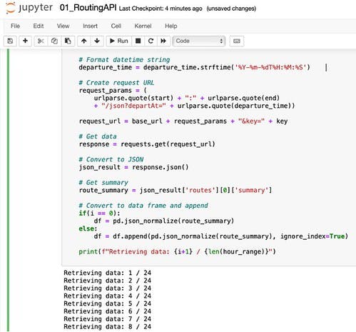
Finally, we send twenty-four requests to the TomTom Routing API to get route information for variable departure times. Note that the traffic data is updated every fifteen minutes so there is much more detail to have in an analysis, but we are setting a one-hour discreet range for demonstration purposes.
today = datetime.date.today()
departure_time_start = datetime.datetime(today.year, today.month, today.day-1, 0, 0, 0)

hour_range = range(0,24)

for i in hour_range:
    # Update an hour
    departure_time = departure_time_start.replace(hour=departure_time_start.hour + i)

    # Format datetime string
    departure_time = departure_time.strftime('%Y-%m-%dT%H:%M:%S')

    # Create request URL
    request_params = (
        urlparse.quote(start) + ":" + urlparse.quote(end)
        + "/json?departAt=" + urlparse.quote(departure_time))

    request_url = base_url + request_params + "&key=" + key

    # Get data
    response = requests.get(request_url)

    # Convert to JSON
    json_result = response.json()

    # Get summary
    route_summary = json_result['routes'][0]['summary']

    # Convert to data frame and append
    if(i == 0):
        df = pd.json_normalize(route_summary)
    else:
        df = df.append(pd.json_normalize(route_summary), ignore_index=True)

    print(f"Retrieving data: {i+1} / {len(hour_range)}")
Several things are happening here, so let’s break them down.
First, we configure the departure date and time to start as yesterday:
today = datetime.date.today()
departure_time_start = datetime.datetime(today.year, today.month, today.day-1, 0, 0, 0)
Then, we iterate over the hours in the 0-24 range. We also need to format each date and time to match the format of the TomTom Routing API (YYYY-mm-ddHH:mm:ss):
departure_time = departure_time.strftime('%Y-%m-%dT%H:%M:%S')
Then, we construct the GET request URL to include the start and endpoints, as well as the departure_time:
request_params = (
    urlparse.quote(start) + ":" + urlparse.quote(end)
    + "/json?departAt=" + urlparse.quote(departure_time))

request_url = base_url + request_params + "&key=" + key
Now, we send the request and convert the resulting response to a JSON object. From this object, we retrieve only the summary of the route:
# Get data
response = requests.get(request_url)

# Convert to JSON
json_result = response.json()

# Get summary
    route_summary = json_result['routes'][0]['summary']
Finally, we convert route_summary to a Pandas DataFrame. Note that we append subsequent data frames to the first one (the one with the index of 0):
if(i == 0):
    df = pd.json_normalize(route_summary)
else:
    df = df.append(pd.json_normalize(route_summary), ignore_index=True)
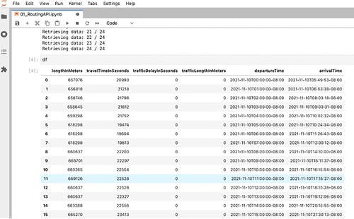
After running this cell, we should see the following results:
Once we have all the data, we type “df” in a subsequent cell to see the data in the Pandas DataFrame:
Once we have the data, we can visualize it.
VISUALIZING DATA
Now that we’ve pulled lots of useful information from the from the TomTom Routing API, let’s visualize the data. We’ll review how to do this using Matplotlib and seaborn so you can see how useful TomTom’s APIs are across different tools.
USING MATPLOTLIB
Let’s start with the Matplotlib. As shown above, our route summaries include information like lengthInMeters, travelTimeInSeconds, trafficDelayInSeconds, trafficLengthInMeters, and departure and arrival times.
Let’s assume we want to display the travel time in hours. We only need to refer to the travelTimeInSeconds column and divide its values by 3600. Then we use the standard plot function from the Matplotlib:
import matplotlib.pyplot as plt

plt.plot(df['travelTimeInSeconds']/3600)
plt.title('Travel time against departure hour')
plt.xlabel('Departure hour')
plt.ylabel('Travel time [h]')
Running this code produces the following graph:
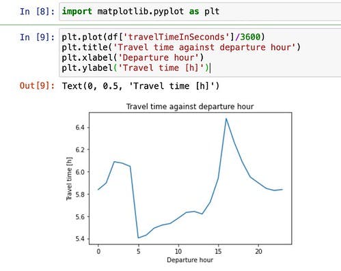
From this plot, we see that there’s a clear minimum in the travel time around 5:00 AM. Let’s investigate the reason for that.
We can now plot the route length in kilometers. Just divide the lengInMeters column’s values by 1000.
plt.plot(df['lengthInMeters']/1000)
Plt.titleed.('Travel distance [km] against departure hour')
plt.xlabel('Departure hour')
plt.ylabel('Travel distance [km]')
After running this code, we should see this plot:
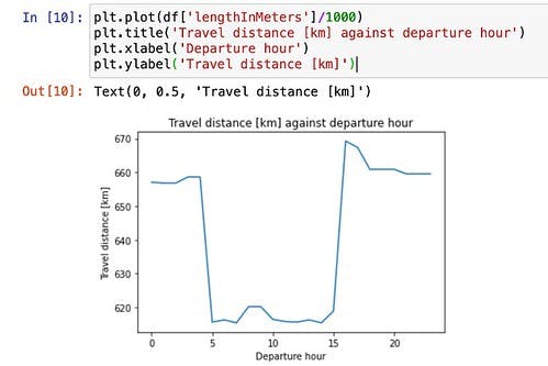
This plot shows that the reduced travel time is due to a shorter route (around 620 km instead of ~ 665 km).
Finally, let’s plot the travel time as a function of route length:
plt.scatter(df['lengthInMeters']/1000, df['travelTimeInSeconds']/3600)
plt.title('Travel time [h] against travel distance [km]')
plt.xlabel('Travel time [h]')
plt.ylabel('Distance [km]')
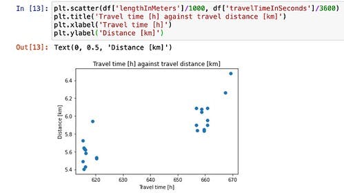
By doing so, we quickly identified two clusters in our dataset: one at around 620 km, and one around 665 km. We did so by using the conventional scatter plot.
USING SEABORN
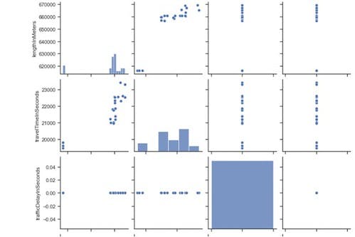
Let’s turn to a final example using seaborn. When doing data science, one of the most common approaches is to create scatter plots for all columns in a data frame. This enables us to identify correlated variables that we may want to exclude from the training process eventually.
Here’s how to use seaborn to create a scatter plot:
import seaborn as sns
sns.set_theme(style="ticks")
sns.pairplot(df)
This code generates the following chart:
CONCLUSION
In this article, we’ve seen that the task of visualizing data from TomTom Maps APIs is a two-step process. First, we retrieve the data and convert it to a data frame. Then, we display it using standard data science tools, including Matplotlib or seaborn.
Because the data retrieval can be slow and incur some cost, you might want to separate it from visualization. Ideally, you want to retrieve data and then save it locally so that you avoid unnecessary calls to TomTom Maps APIs.
Once you have the data, your imagination only limits what you can do. You can visualize the data as you want. You most likely have new ideas in mind. So, don’t wait any longer — experiment with TomTom Maps APIs today.